Two week sprint
One week for research
One week for prototyping
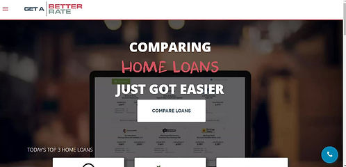
Case Study: Get a Better Rate


THE CLIENT
Get a Better Rate is a digital mortgage broker, providing customers a digital solution fully supported with a physical service but also a qualified mortgage broker.
As part of the Academy Xi course, we set out to increase customers and give them a better experience during a mortgage application.

What are we trying to solve?
Potential Customer
Aid first home buyers in digesting and obtaining a home loan as navigating mortgages is complicated. By empowering the first home buyer to access important information, Get a better rate will gain trust and authority as a mortgage broker service.
Existing Customer
Provide better communication channels with existing customers as compiling documents and waiting for approvals is stressful and important communications can be easily lost in email. As a result, Get a better rate will gain more customer loyalty and referrals.


Alexander Ho
UX Designer
My role in the team was co-leading the team on direction and time management.
Research was a team effort and in the prototype I took charge of the signed in dashboard and cashback page.
What did I do?
Our Constraints
LIMITED RESOURCES
The owner is the developer
Only one person in the company
TWO WEEKS
One week for research
One week for prototyping
ALL REMOTE
Collaboration and testing
Understanding people
Desktop Research
Online research
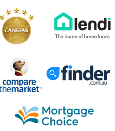
Competitor Analysis
Compare the market
Canstar
Lendi
Finder.com.au
Mortgage Choice
Survey
24 Responses
54% Female - 46% Male
Age group 25-60
75% NSW - 25% Others
71% Applied mortgage before
25% have a plan within a year
1 on 1 Interviews
15 Interviews
Age bracket 25-62
6 Females & 9 Males
13 experienced applying for home loans
2 have the plan to apply
Usability Test
8 Tests on existing desktop and mobile website

What's the environment?
Desktop Research
We compared the different competitors in the home loan comparison market and found that most of them don't provide mortgage broker services and can be quite overwhelming with information.
Get a better rate must differentiate by having a seamless experience from loan comparisons to broker and simplifying the information displayed in comparisons.

Survey
Not everyone has time to talk,
so lets send a survey
52.1% feel overwhelmed looking for home loans
74 % use desktop to research home loans
What is important when deciding a lender
-
Interest rate
-
Lender Reputation
-
Other charges
Most important factor defining mortgage broker experience
-
communication
-
Quality of service
-
trust
Most difficult in obtaining home loan:
-
compiling the documents
-
choosing right home loan
-
choosing right lender
Prefer to be communicated by broker
-
email
-
phone call
-
phone message


1 on 1 Interviews
Let's talk to real people!
“It’s frustrating, you’re just waiting, you don’t know what’s going on.” - Robert, 40
“When I first applied, I don’t know where to start.” - Diane, 54
“Sometimes you’re being tricked because you don’t know whether they’re actually trying to the best product or whether they’re giving you the best product makes them the most money.” - Daniel, 37

Interview Key findings
-
Trust and referrals from family and friends for advice
-
People feel anxious because a home loan is a big commitment
-
People feel like there's a lack of educational resources on home loans
-
People don't like waiting long for approvals
-
Most people don't understand how brokers make their money and concerned if brokers are hiding information
Usability Test
“Style quite basic but it works. Can be sharper or more refined"
“All info is there, but the layout is unsophisticated."


Mobile
4.3/10 from
4 participants
Desktop
5.0/10 from
5 participants
Key findings
-
Branding inconsistent
-
Navigation not intuitive
-
Trust is not clear on website
-
People are confused with terminology
-
Mobile version harder to use
-
Website doesn't work on Safari
Define
Here we used all the insights to create a personified into two people and their journeys.
Meet Daniel and Michelle


How might we...
From the pain points comes opportunities
Daniel
-
Better educate Daniel on mortgages and terminology so that he can feel confident about the process
-
Present home loan comparison information in such a way that Daniel feels confident about his choice
-
Build trust for Daniel on the Get a Better Rate site so he is enticed to use it and leave his contact details
-
Ensure that technology enables Daniel without frustrating him
Michelle
-
Make the collation of documents easier and more effective for Michelle
-
Keep Michelle updated with the progress of her application so she feels more in control and positive about the experience
-
Communicate more effectively with Michelle so that she does not miss any important messages

Ideation
We ideated and sorted the our ideas in to a minimal viable matrix with the client.
Daniel
First home buyer
Furious 5s
Five Ideas
Five Minutes
Each Person

Our ideas organised into postit notes on Miro

Using the MVP we identified features that would be quick wins
Our ideas organised into postit notes on Miro
Michelle
Upgrader
Creative Matrix
Five Sections of Business
Ten Minutes
Each Person

Our creative matrix with our ideas in post-it notes and each person voted for the top 5 ideas using coloured dots

Using the MVP we identified features that would be quick wins
Our creative matrix with our ideas in post-it notes and each person voted for the top 5 ideas using coloured dots
Develop
Low Fidelity 1
From sketches and user flow
5 User testing
Low Fidelity 2
User feedback changes
5 User testing
High Fidelity 1
User feedback changes
4 User testing
High Fidelity 2
User feedback changes
5 User testing
4 rounds of user testing to reach final prototype
User Flow
Initial mapping of our prototype


Design & Test - 3 Iterations
Delivery
Rebranding
Together we come up with a brand guide as customers valued reputation and trust.
-
We talked to the client and took away key brand values: Simple, Functional, Fast and Personal
-
Based on the values and customer feedback, we aligned the brand fonts and colours.
-
Redesigned the logo based on the new font and feedback
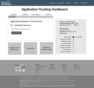
High Fidelity prototype
“Looks okay, maybe trustworthy”
- Georgia
Favourites button “Button looks like I am liking that lender?” - Kim
“Just what you need” - Andrew
“I like the fact it is showing me all of the lenders” - Kim
“Looks very user friendly” - Artie
“I like the sort function” - Gyongyi
“Application details a bit jumbled” - Ryan
“Would like to see news” - Artie
Outcomes
Delivered:
Developed a prototype for the PWA and Website
A simple branding guide
Achievement:
After our presentation, our client said that now he has "a lot to think about".
Reflections:
I learned about how a progressive web app (PWA) works and how it ties in with UX design
I realised that SEO must work with UX design for best results when it comes to searchable content
I should learn more about SEO, Content strategy, link building, and technical SEO
If we had more time, we should flesh out more of the logged in state and the rest of the website and PWA